OurCar: What I Learned Making an App for my Family
An adventure in making a utility
TL;DR: I made an app to share a car with my family using flutter. It was a very interesting experience.
Necessity is the Mother of Invention
We were sitting around the kitchen table trying to make a plan for splitting the gas bill. This was an ongoing problem, and me joining the family had only made it worse. There needed to be a way to determine who needed to pay for filling the car, because otherwise, whoever got it when the tank was empty got left with the bill, and that was just plain unfair. To be clear, we all tried to make sure to fill up when we used a significant amount of fuel. But if you drive the car to the store and back, it doesn’t use a lot of gas, and you don’t feel like it needs a fill, but eventually the tank is empty. It’s a death by a thousand cuts.
The first suggestion thrown around was from my sister-in-law. One would refill however many kilometers you drove. One of the views on the car’s display says how many Km are remaining until the tank is empty, which is based on the average efficiency of the current trip. The obvious difficulty with using this information, is that you can’t go the gas station and ask them to fill up 100Km of petrol in your tank, you can only ask for liters, so that plan was a bit problematic.
I then realized that you could take the trip odometer reading combined with the trip efficiency reading to calculate exactly how much gas was used on that trip. However, no one else was quite as excited at the prospect of doing that math every time, so a different solution was needed. We settled on everyone filling up the car each time they used it, which —while it kinda worked— was just very annoying if you just took the car for a small errand.
I’d been itching to build an app for a while, and just needed the right idea to get on it. Suddenly, here is a problem waiting to be solved, on a silver platter! There were other issues we were having with sharing the car: finding out who had it; where they parked; scheduling conflicts; so the empty gas tank was the straw that broke the camel’s back. I figured I could put together something that could solve most of the issues we faced without adding friction, and began immediately working on a prototype.
The Birth of a Product
I defined the scope for this project as “An app that’s better for sharing a car than a WhatsApp group”. This meant it needed to be able to:
- Know the car’s location (only when it was available, it was no one else’s business where I took it).
- Know the status of the car, so we could know who had it and when (very helpful when chasing down tickets).
- Keep track of the gas tank and who used how much (so we could know how much any of us needed to fill up). There are obviously some things needed beyond this, but all of them are in service to these goals, so I didn’t see the need to write them down.
I looked to see if there were any other apps that could do this kind of thing, but at the time, I found nothing. There were some apps that do something similar for businesses, allowing employees to easily track usage of a company car, or allows companies to manage a fleet. But there was nothing I could find that was all that good for our use case, a few friends or family that want to share a car.
The stack I picked for this project was very simple, Pocketbase⇗ and Flutter⇗ (I later added Riverpod⇗ for state-management and Auto Route⇗ for navigation and routing, but more on that later). I chose these because I had tried both of them in previous projects, and they worked perfectly fine for what I wanted to do, so I figured they would work just fine for this as well. This was correct.
I worked on the initial prototype over the course of a week (pretty much full-time I think, I was between jobs at the time), and had gotten together something that was a few basic pages:
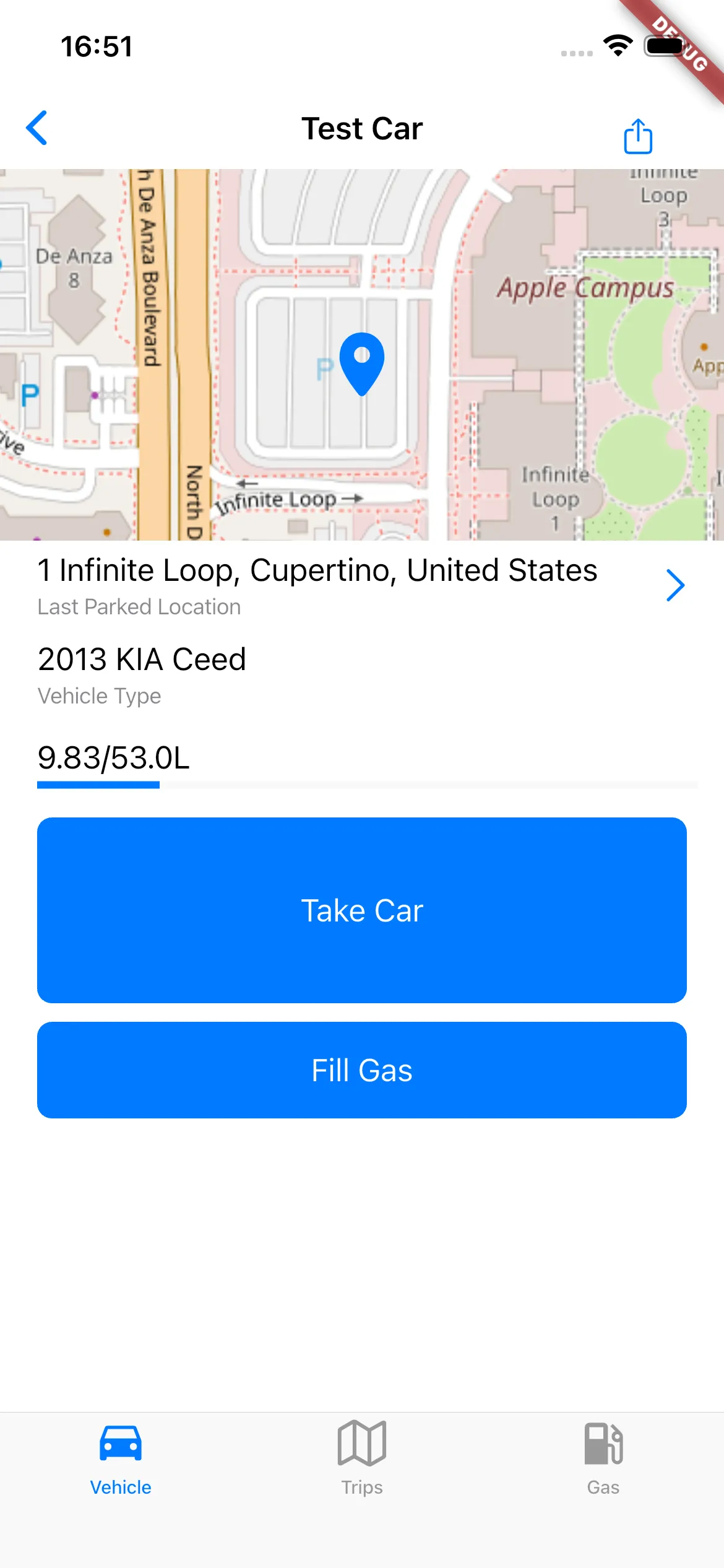
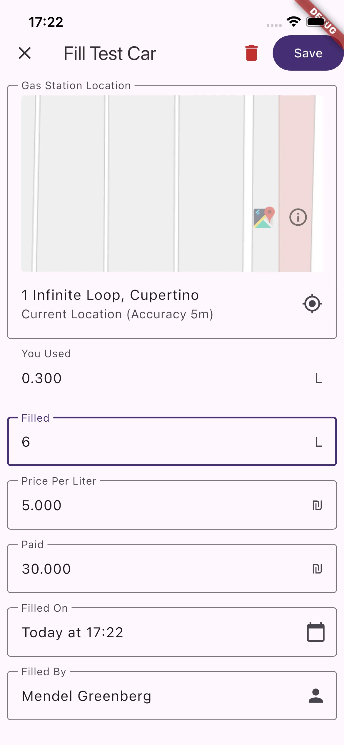
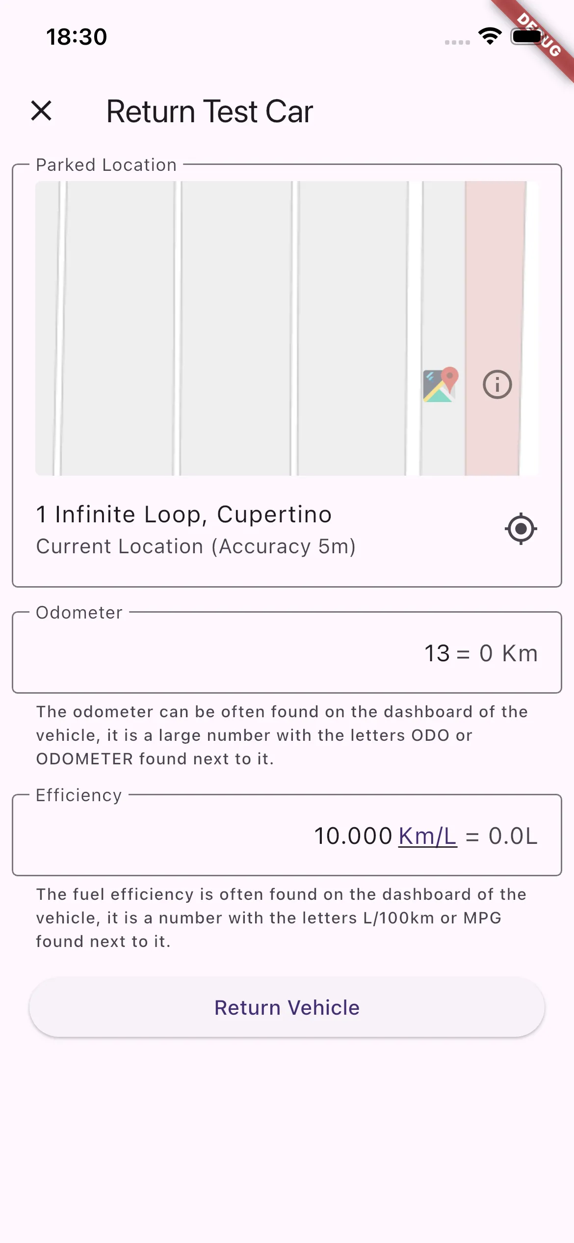
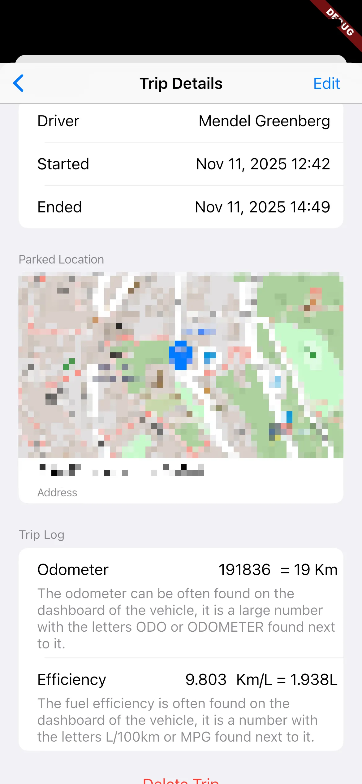
- A main page that showed basic details about the car: current location, odometer, estimated tank level, and a button to mark the car as taken.
- A list of all the trips the car had taken
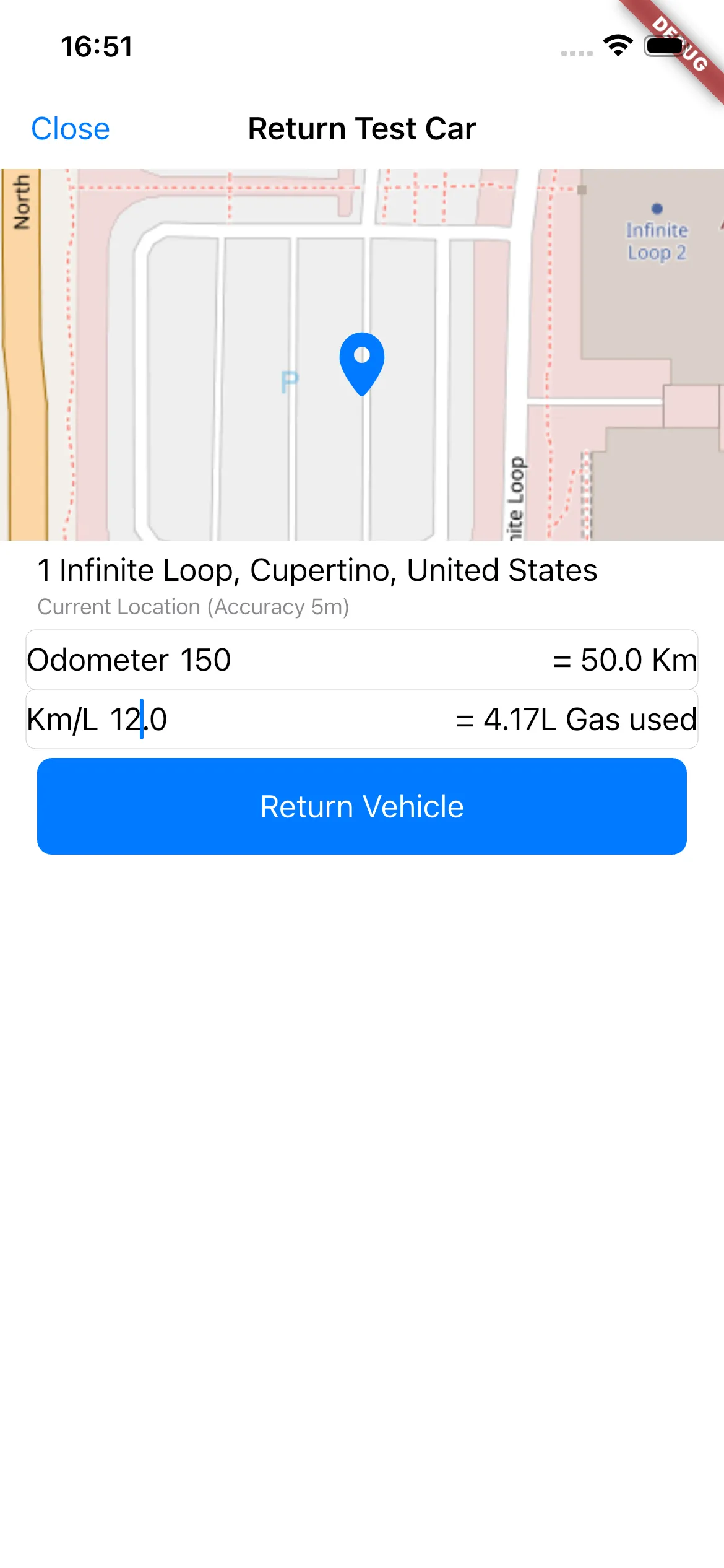
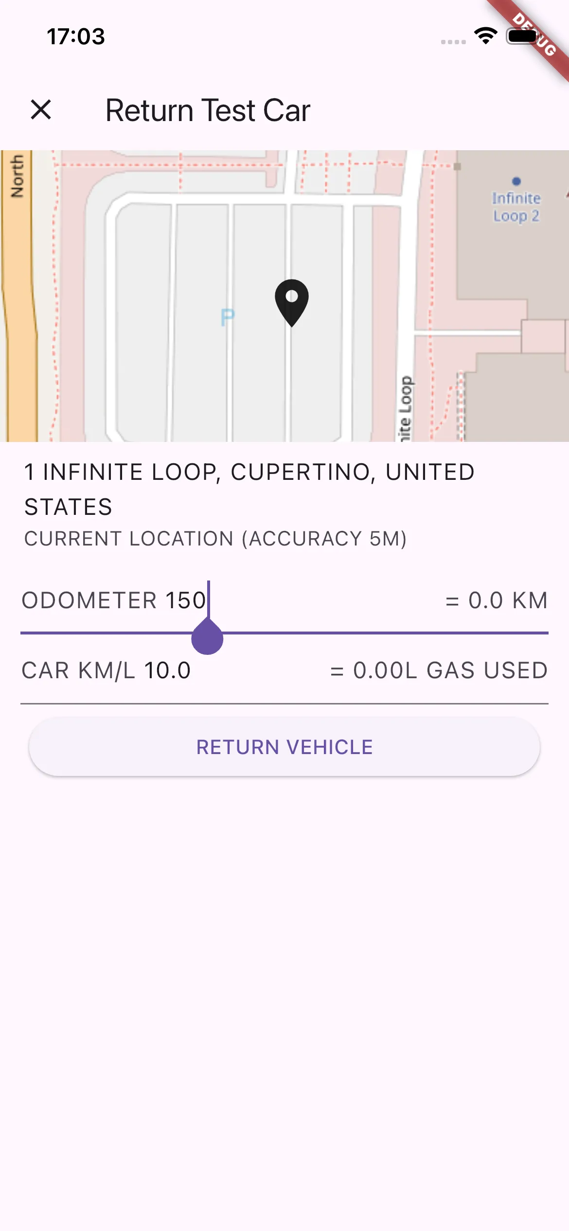
- A form to track returning the car (gets the location, odometer, and trip efficiency)
- A list of the fuel fill ups
- A form to fill out when filling gas (gets the amount and price)
- A form to notify other users if someone wished to take out the car at a certain time.
Those last three got built a little later.
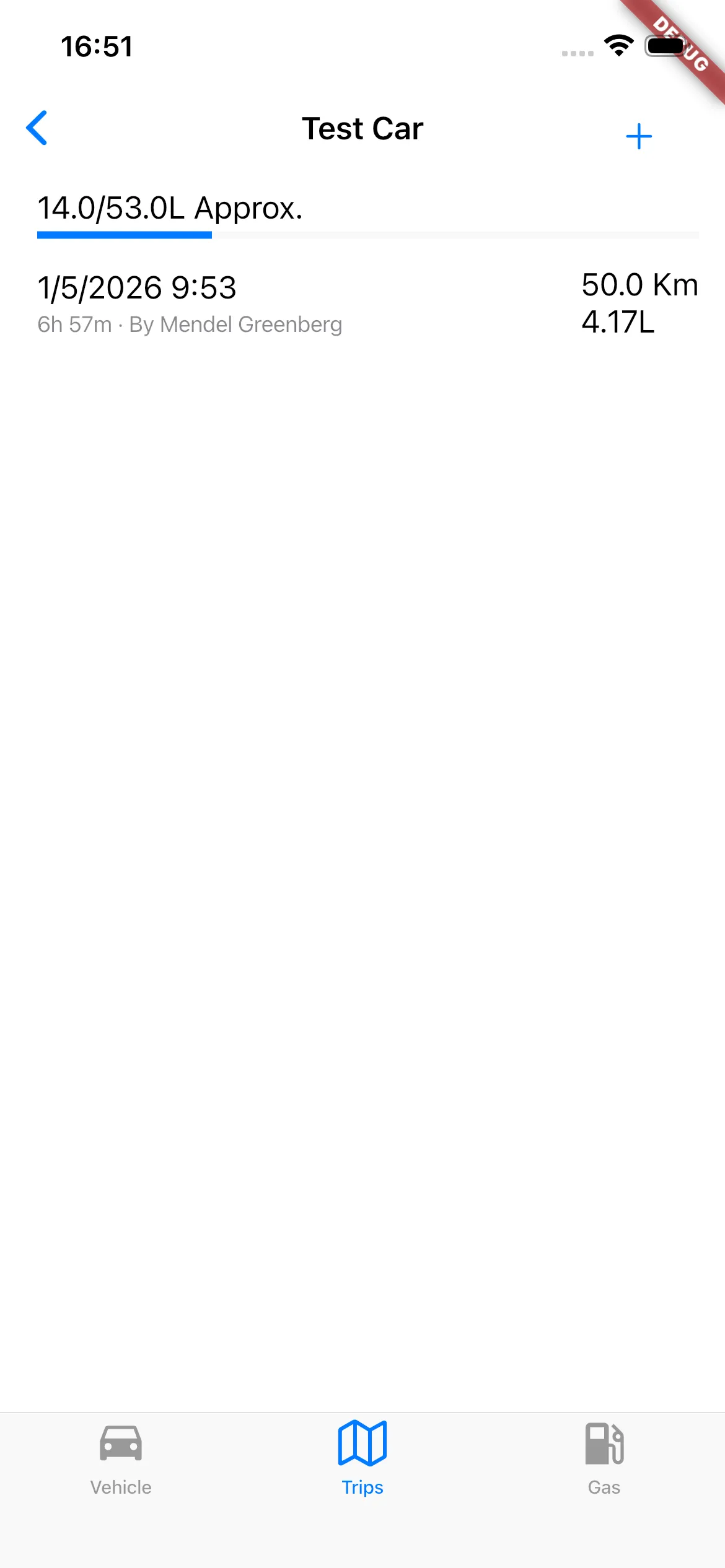
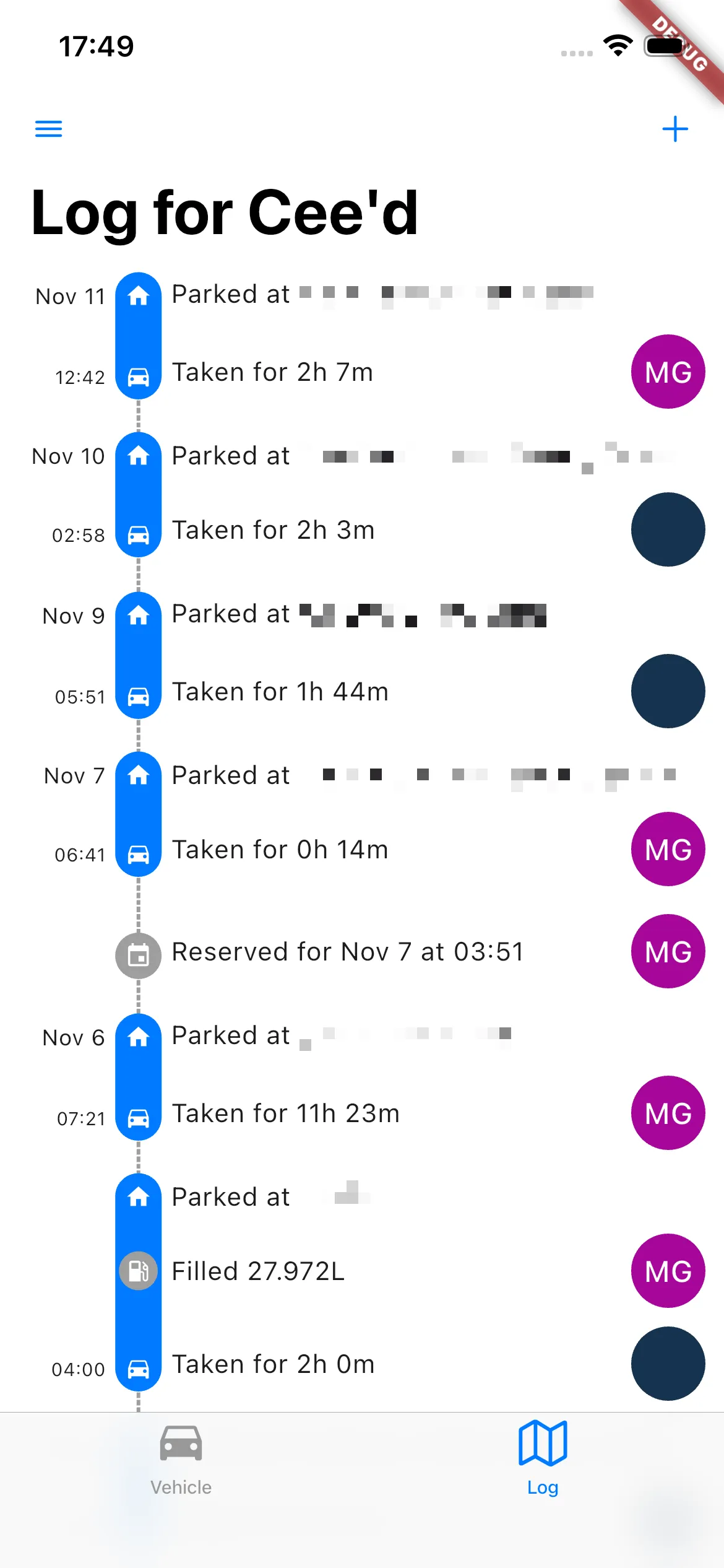
This core stayed pretty much unchanged. A few pages were added to cove. some other things: User management, car settings, some other small menus, and later, the list of fill-ups and the trips was combined into a unified timeline (more on that later). But overall, it remains this simple.
On the backend side, I added a hook to Pocketbase to allow sending the aforementioned push notifications. Later down the line, I would take advantage of this capability to add a bunch of other small features. Suffice to say, going with Pocketbase was a very good decision for this project.
There was the obvious number of bugs and warts that a prototype application has, but it was cool, promising, and had product-market fit (the holy trinity as far as I’m concerned), so now I just needed to get it onto their phones. I decided to upload it to the various app stores, and use the beta testing features to distribute the app. I opted for this route, because (I thought) it was much simpler than going around and messing with everyone’s phones. This was not exactly an enjoyable process.
Needing to figure out the mess that is Apple’s iOS notarization was incredibly annoying, and later I gave in and paired my wife’s phone to my developer account just to simplify this process. Publishing to Google’s Play Store is simpler, but not significantly. Fortunately, most of that was a one-time setup issue, and deployment tends to be much more straight-forward now (I still don’t understand Apple’s need to review beta applications). Ultimately, once I had uploaded it, I just needed to ask everyone for their email, and then they could download the app.
During this process I needed to actually decide a name for the project, because I didn’t want to be stuck with an appbundle name (com.mendelgreenberg.<something goes here>) that sucked. When I created the folder I named it “gastrax” which is perhaps a bit a clever, but not a very good name, and my wife rightfully insisted that we pick something better. She sat with ChatGPT for a bit and after throwing around way too many names (some of which already existed), we came up with OurCar, which is undoubtedly much cuter. So now that I had a suitable name, I could actually upload and share it with everyone.
I immediately started getting feedback.
Defining Scope, Or: Saying No
I got ideas and complaints:
- “Can it track the maintenance schedule?”
- “It’s too annoying to type in. Can I just take a picture of the dashboard, and it’ll scan it?”
- “It should do GPS tracking so you don’t have to put in the numbers”
- “How do we split gas?”
- “You should be able to make scheduled trips”
- “How do I use it?”
- Etc.
I found myself needing to decide between what I wanted to work on and what needed improvement. Worse, I needed to choose what not to do. I had enough of a vision of what needed to be built that most of the feedback was already on my list. But still, there were ideas that I needed to say no to, either because it didn’t fit within the scope, or because I felt it was an anti-feature: something that —while it seemed useful— actually made the app worse.
A good example of this was GPS tracking. The idea is that the app tracks your location throughout the trip, and can use that (combined with the car’s advertised efficiency) to know how many miles were driven, and how much gas was used. Plus, you get a nice visualization in the app after the fact. The problem with this idea was two-fold: I couldn’t find a way to implement this that wouldn’t use a ton of battery (live location tracking is very battery-heavy), and worse, it would violate everyone’s privacy. All the details of the car and its trips are shared: who took the vehicle, when, and for how long. If I added where they took it, that would instantly allow everyone to know when my brother-in-law went on a date. All we actually needed to know is where they parked the car when it was finally available (we can use GPS for that). So that was a feature that was going to stay out.
On the other hand, there were complaints and requests that were totally valid (like taking a picture and using computer vision to read the odometer and gas meter), but I realized that they usually stemmed from the user experience (UX) being too clunky. Most of the time, this was because despite the user interface (UI) using the right widgets on iOS or on Android, the app wasn’t natural to use on either platform, making it somewhat confusing.
I figured that if I could fix this up, everyone would find it easier to use, and would stop asking for workarounds.
The Design of Everyday Apps
When it comes to look and feel, the philosophy that I quickly adopted was to attempt to be as “native” as possible. Now, Flutter is not the native GUI framework on either platform, but the framework provides widgets that are very close to, if not exactly, matching the native toolkits. In practice, this philosophy meant that my app was not going to have its own style and feel, but would instead get out of your way, and feel like it was integrated into the platform. Additionally, I wanted the app to be very quick, intuitive, and easy to use.
There were various challenges I had in achieving this goal, first and foremost: I am not a designer by any means. I would like to imagine that I have some taste in this area, but certainly when starting from scratch I’m out of my depth. So often, I build a UI that is dense, hard to navigate, and very clunky, but still I’m scratching my head about what to improve. Admittedly, it seems practice is the key here, as over time I’ve found I’m slowly starting to get a better sense for what are good ways to do things.
One of the first issues I encountered (I know I’m not the only one) is that Flutter provides no built-in method to use the correct widgets for each platform automatically. It seems the accepted method is to build to separate views for each page: one for Material, one for Cupertino (Material is the name of the design system for Android, Cupertino is the name of Flutter’s implementation of Apple’s design). I found this really not ideal, and in fact it would have been a significantly larger pain-point if not for Flutter Platform Widgets⇗: a package that provides adaptive versions of (almost) all widgets. Even with this however, there are many areas where the layout idioms differ significantly between Android and iOS, enough to mean that I created some intense spaghetti to be able to flexibly handle the difference. I still haven’t gotten around to figuring out how to organize or abstract the code so that it’s cleaner. I would be willing to say that maybe I should have written my code better as opposed to relying on something like FPW. But practically, Flutter doesn’t seem to espouse a particular method of designing your application that makes this problem easier to solve, so this is what I’m stuck with.
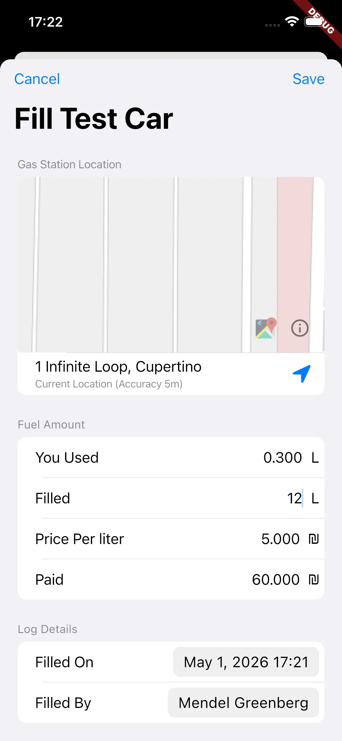
I should add that I really had a hard time finding good examples of native-feeling apps, and more specifically, dashboards, lists, and forms. There are many ways one can go about doing something, but there are only a few good ones. It doesn’t help that the Human Interface Guidelines provided by both Apple and Material are not very prescriptive, and don’t provide a lot of guidance on how to use different styles in a given scenario. After hunting around, I realized that WhatsApp is trying to do the same thing, and they got as close as possible to achieving it. I think it’s the best example of a native-feeling app on both platforms. So I frequently referenced and based many design decisions on what they did. So far, I think it really helped, as these small touches made things feel a lot more cohesive.
I did also reference a few other native apps for specific features, most memorably, the iOS Calendar app for how to design a form.
As I started making these cohesiveness improvements, I found that I started to enjoy using the app more, and that everyone else was complaining less about the app being annoying. I recently picked up The Design of Everyday Things⇗, and found that Don Norman stresses this point throughout the book: If you follow standard idioms, people suddenly understand how it all works, because they’ve encountered that kind of interaction many times before.
Writing Code
In the process of fixing some early bugs, I ran into an issue (actually a few similar issues) where I could start a “trip”, but the main dashboard wouldn’t show the trip timer until I force-refreshed the page. After doing a bit of research into how to synchronize state across multiple pages, I discovered I wasn’t the only one with this problem. At a fundamental level, because all the data was actually managed on the server, I needed a way to force update the app after the user made any changes. The solution I chose was to use Riverpod⇗, a library that manages synchronizing multiple pages that derive their state from a single source through some codegen and magic. There were still some sync bugs that I had, but most of them were much easier to track down once I had something that was actually managing state sanely.
Another thing that I was constantly trying to improve was performance. Flutter is somewhat infamous for its jank, but in the past few years most of the underlying issues have been fixed (see the new Impeller renderer). So nowadays it mostly comes down to developers not writing good code. In my case, the app’s performance issues stemmed from me not writing good code. I made a number of mega-widgets that still need to be cleaned up and split into smaller, more manageable widgets.
The main problem this causes is that one small change in state can cause a lot of repainting because of the widget having a large shared state. If you’re not familiar, Flutter uses a model very similar to React, where state changes in a parent can cause the whole widget, including its descendants, to be redrawn (however, I believe there is some caching in place). This means that small things can have big performance ramifications. On the other hand, this is relatively straightforward to fix, you just need to split things up into smaller widgets with their own state. The reason I didn’t do it up until now, is that figuring out the right way to split up the state to fix the redraws was not all that simple, and I never took the time to really sit with it and find the right mental model. Due to all this, typing text in certain forms is just slow.
This is not Scalable
Over the course of development, I was struggling with the data model for keeping track of the car’s status. It was rather complex and requiring updating data in multiple places to work correctly. At the same time, I realized (after getting some complaints about it) that having the Fuel log and the Trip log as separate pages was rather confusing. It made it hard to easily keep track of what happened when (and in what order). So I figured I could solve both of those issues by merging the two logs into one single timeline.
The way I did this was by switching to using a log that the code would go through to determine the current state of the car, as a sort of state-machine. Basically, there are certain actions that can be taken with the car depending on its state:
- It can be taken if it’s returned
- Conversely, it can be returned if it’s taken.
- Ergo, it can’t be taken, if it’s already taken.
There’s more to it, but that’s the gist. This way, instead of separately tracking trips and fill ups in their own separate logs, and separately the changes that those made to the car’s state in yet another log, I would just track them all in one grand log, greatly simplifying the way updates were handled.
Unfortunately, this was not as simple as I’ve made it sound. This took me a lot of time to design and implement, and had a number of bugs in the beginning, especially while I figured out how to structure the implementation so that it wasn’t terribly slow or annoying.
To be honest, the implementation is still not perfect, and there are a number of kludges I implemented to try to make things more efficient. All in all, I think the idea was good, but the execution certainly leaves something to be desired. If I had to do it again (I probably will rewrite it at some point), I would structure the code so that it would use an “abstract” state machine, which is a fancy way of saying logic that is independent of data. What I was doing now was very tied to the way I stored the log, which made it very hard to debug. Abstracting it would mean that the state machine doesn’t know or care how the data is stored, it simply asks for certain data points, and transforms them based what state it’s in. This would allow me to rigorously test it, and therefore easily discover most (if not all) bugs before it ever touched real data.
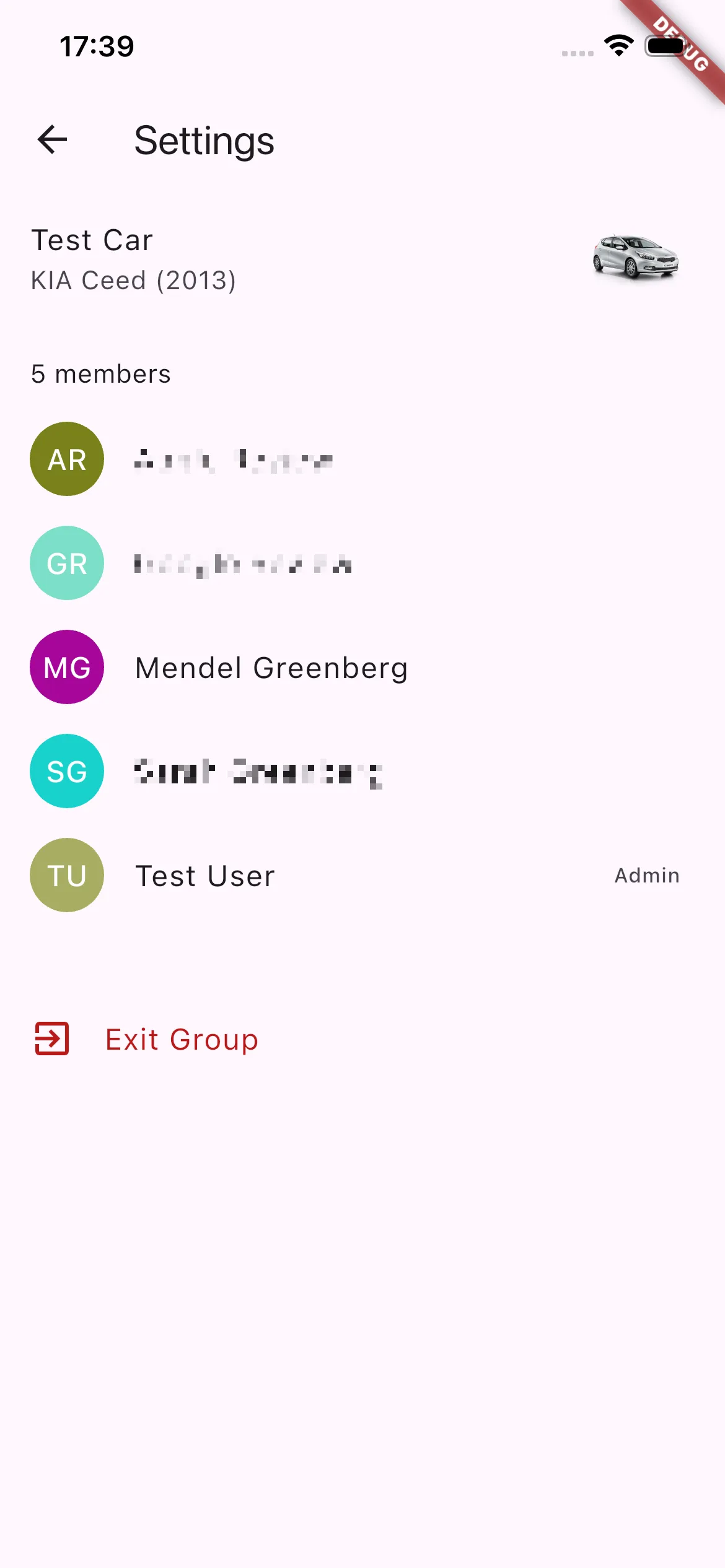
In the meantime, I started moving the app in the direction of an open beta, which meant preparing a bunch of things that Google and Apple need (not unreasonably) so that they can distribute your app: screenshots, descriptions, privacy statements (we store user data in the “cloud” after all), an account deletion portal, etc. The account deleting portal I actually built with an agent, and that was a rather successful endeavor. I also built features that would let other people actually use the app without requiring my active involvement, features like User Management, so that you could invite and remove users from sharing a given vehicle. Up until now, I had to manually add users to the vehicle in the backend (for that matter, I also needed to manually create the vehicle), this was not very scalable.
As a part of fixing that, I needed to build an invitation flow for adding new users to a vehicle. The idea was: you would invite a user, they would get an email with a link, and clicking the link would open the invitation in the app. In order to do this, I needed to enable deep-linking, where you fiddle some configs that tell the phone’s OS to open certain links in the app. In order to that, I needed to add actual navigation to the app (so that the deep link could go somewhere).
Up until now, it was very much a hodgepodge arrangement with calls to push and pop all over the place, and state-passing was kind of a mess. So if I didn’t want to implement all the complex handling myself, I would need to put on my big-boy pants and implement navigation using a router. For some reason, this is harder than it should be - there are multiple packages which do it, each of which provides multiple methodologies for actually implementing it in code. They also all suffer from unclear documentation that don’t help with understanding what are the correct models for how navigation works (in said library). I ended up sticking Auto Route⇗ after trying a number of different options. So I spent more time than I would like to admit fighting bugs until I realized that I just needed to fiddle with the way I implemented things so that it was “more correct”. On the plus side, adding a router dramatically simplified the complex navigation logic I had built over-time throughout the application, so count that as a lesson learned (just do it from the get-go).
Where I Go From Here
I think I managed to make an app that made good on its goal. I didn’t get close to 100% there, and there are a number of areas that could use improvement. But overall, I find it a pleasure to use, and everyone else doesn’t hate it.
I talked a bit earlier about how I started trying to get more users, and preparing the app for this next step, but I was also having trouble finding other users (to be honest, I didn’t look all that hard, but still). I was also sketching out bigger features I could add for a 2.0 and the ways I could monetize the app in the future. But ultimately, before the project ever got to that point, we ended up moving away from the family, and all of my sibling-in-laws with whom we were sharing the car, also moved away around the same time. So a lot of the enthusiasm for working on this project dried up. I think I only ever found one other group interested in using the app, and that wasn’t really enough excitement for me to get it over the line.
I still hope that just maybe I’ll need it again, or I’ll find someone who does, and I’ll be able to get it to a 1.0. But right now I don’t have a need for it, so the app is sitting in limbo, forever in alpha.
Thank you to Manu and Berel for reviewing this and providing suggestions to improve the post. I used Claude to review early drafts. All writing is my own.